Book of Durrow
( 25% )
Physical description and codicology
The Book of Durrow (TCD MS 57) is the earliest surviving fully illuminated Insular Gospel book — it has been called “the earliest surviving fully decorated insular Gospel manuscript” — most probably produced in a Columban milieu c. 650–700; its precise date and place of origin (Durrow, Iona, or Northumbria) remain genuinely unresolved, and that scholarly disagreement is itself a defining feature of the manuscript’s historiography.
Trinity College Dublin’s catalogue and digital collections identify the book as IE TCD MS 57, “Book of Durrow,” with the historic pressmark A.4.5. Per the TCD/Edinburgh University catalogue description, “The manuscript, comprising 248 folios and measuring approximately 245 x 145mm, is laid out partly in 2 columns with 25 lines, and features coloured decoration including six carpet pages, five Evangelist portraits, and initials.” The medieval foliation runs to 245v; CODECS and Wikipedia concur on 248 vellum folios. CODECS rounds the dimensions to 25 × 15 cm and the facsimile description gives 24.5 × 14.5 cm — a rounding difference, not a substantive conflict.
The text is written in a single, highly accomplished Insular majuscule (insular half-uncial / “insular semi-uncial”). It is widely held to be the work of one scribe, as current exhibition materials state explicitly.
The support is vellum (calfskin). A conservator’s examination during the 1953–54 conservation campaign — published as “The Book of Kells, the Book of Durrow. Comments on the vellum, the make-up and other aspects,” Scriptorium 10.1 (1956), pp. 3–21 (DOI 10.3406/scrip.1956.2647; available via Persée) — is the foundational codicological source. The study opens by noting that “The privileged occasions of repairing and rebinding the Book of Kells during 1953 and the Book of Durrow during 1954 offered opportunities for examining both books such as had not occurred for nearly sixty years.”
It was recorded that the vellum leaves vary considerably in thickness but have very smooth surfaces, that flesh-side and hair-side are generally arranged indiscriminately, and that the flesh-side was generally chosen for full-page ornament. Crucially, the study found that many leaves now survive as single leaves (singletons) rather than folded bifolia: “In two places there are three of these single leaves adjacent in a single gathering. In another place nine of them occur between what was probably a once-conjoint bifolium.” A run of single leaves spanning the end of Luke into the beginning of John was identified. The page size has been reduced by successive trimmings and rebindings.
Full quire collation is complicated precisely because so many leaves are now singletons; Powell’s 1956 study is the base analysis, synthesised by Meehan (1996). A complete published quire-by-quire collation formula and the detailed ruling/pricking pattern could not be verified against an authoritative catalogue for this report and should be taken directly from the primary codicological literature and the accompanying facsimile commentary (1960).
Non-invasive analysis (micro-Raman spectroscopy and X-ray fluorescence) has established a deliberately restrained palette. The Durrow-specific study is “Non-Destructive in situ Analysis of three early medieval manuscripts from Trinity College Library, Dublin (Codex Usserianus Primus, Book of Durrow, Book of Armagh),” in Making Histories: Proceedings of the Sixth International Conference on Insular Art (York 2011), Donington: Shaun Tyas, 2013, pp. 42–49. The pigments identified on Durrow are: red = red lead (minium, Pb₃O₄); yellow = orpiment (As₂S₃); green = a copper-based green (reported as verdigris/copper acetate); black/brown = iron-gall ink (the background that reads as black is in fact dark brown).
No blue (indigo) and no gypsum white have been reported for Durrow, and no gold is used; “white” is reserved (uncoloured) vellum and “pink” effects are achieved with red-lead dots over blank vellum. This is corroborated by a Durham University study, “Pigments of the Earliest Northumbrian Manuscripts,” which cites the earlier Raman analysis directly and treats Durrow’s palette as red, green and yellow plus black ink and ‘white’ parchment. (Caveat: the internal wording of the 2013 article — e.g. whether “verdigris” or the more cautious “copper-based green” is used, and whether indigo/gypsum are explicitly excluded by Raman — could not be quoted from the primary text, which is not openly accessible; the identifications rest on the Durham peer-reviewed article and TCD’s own conservation pages.)
The Durrow palette is markedly narrower than that of Kells. The most extensive Raman study of any single medieval manuscript is “The examination of the Book of Kells using micro-Raman spectroscopy,” Journal of Raman Spectroscopy 40 (2009), pp. 1043–1049, which states: “In total, 681 sites over the 4 volumes of the Book of Kells were analysed using 2 separate laser wavelengths (632.8 and 532 nm), making this the most extensive Raman spectroscopic investigation of a single medieval manuscript,” identifying “blue (indigo), red–orange (red lead), yellow (orpiment), green (vergaut), black (carbon and iron gall ink), and white (gypsum),” with purple (orcein) also discussed. Durrow, by contrast, uses essentially three mineral pigments plus ink and reserved vellum — no indigo, no gypsum white, no organic glazes. This contrast is a concrete, citable index of the two books’ different technical resources.
The medieval silver book-shrine (cumdach) is discussed under Provenance. The medieval binding was lost during the military occupation of Trinity College in 1688–89; by 1699 the book had only “a plain brown rough leathern cover.” The current binding is half-tawed pigskin over wooden boards, completed by the conservator in 1954. Because so many leaves are now singletons, each leaf was mounted/guarded for stabilisation at that rebinding.
The book is badly damaged from over a millennium of use and misuse. Folios 208–221 show particular water-damage and a hole in the top right corner, consistent with a section having been detached, tied with string through the hole, and dipped in water (the cattle-cure tradition; see Provenance). Damage at the beginning, end and edges has been attributed to the ill-fitting nature of the cumdach.
Contents
The book contains the four Gospels in the Latin Vulgate of Jerome, with prefatory matter: the Letter of Jerome to Damasus (Novum opus), prefaces, the Eusebian canon tables, breves causae, argumenta, and an interpretation of Hebrew names. Françoise Henry characterised Durrow as “a relatively straightforward Vulgate,” contrasting it with the Book of Armagh, which she regarded as typical of the “mixed Irish text” with a considerable admixture of Old Latin/pre-Vulgate readings. Older reference works (e.g. the New Catholic Encyclopedia) describe the text as Vulgate “with Old Latin Prefaces.”
The canon tables survive (e.g. Canons V–VIII on fol. 9v). A notable feature discussed in recent scholarship on the Eusebian apparatus is a reversal in Canon VIII of the standard evangelist order, from Luke–Mark to Mark–Luke, a reversal also present in Kells and in the Anglo-Saxon Royal I. E. VI.
In relation to the gospels sequence, we can say that the evangelist symbols are assigned in the pre-Hieronymian (pre-Vulgate) manner.
The colophon (f. 247v). A subscription, now partly erased and overwritten, asks the reader to remember “Columba the writer, who have written for myself this Gospel through twelve days’ space by the grace of Our Lord the Holy Spirit.” (Some sources cite this as f. 247r; the “f. 9r” given by several web encyclopedias is an error.) The colophon was at some point altered to imply the book was written by Colum Cille himself — a claim scholars reject, since Columba died in 597, roughly a century before the manuscript’s likely date. Twelve days is a plausible span to copy one Gospel but not four with full decoration. The colophon most plausibly reflects the copying of an earlier Columban exemplar, and later served to establish the book’s status as a relic. A dedicated study of the colophon appears as “The colophon in the Book of Durrow,” Hermathena 168 (2000), pp. 71–75.
A memorandum on f. 248v, added c. 1100 by the Durrow scribe Flannchad Ua hEolais, records a transfer of land from Killeshin to Durrow (treated in “Observations on the Book of Durrow memorandum,” 2015). A Pentecost reading, Acts 2:1–4, was added on a blank page (f. 192r) in the twelfth century. The historian Conall Mac Eochagáin (Conall McGeoghan) signed the book at Christmas 1633 (f. 124v), where a note “Ora pro me frater mi, dominus tecum sit” also appears.
Decoration programme
The illumination programme comprises eleven full-page miniatures — six carpet pages and five figural (evangelist-symbol) pages — plus six major decorated incipit/initial pages and numerous minor initials. Each Gospel is prefaced by a set of decorated pages: an evangelist-symbol page, a carpet page, and an incipit/initial page. Matthew is the exception, now lacking a carpet page.
The double-armed cross carpet page
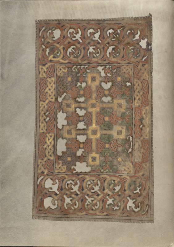
The verso of the first folio carries the earliest of the codex’s carpet pages and, in the sequence as now bound, the reader’s first encounter with the manuscript’s decorative programme. It faces the four-symbols page, and the two folios function as a paired prefatory unit: an abstract cruciform statement on the left, its christological gloss in the evangelist symbols on the right.
The design is built on a triple armature of frames. The outermost register, broad along the upper and lower edges and narrower at the sides, is filled with a continuous chain of interlocking ring-and-ribbon interlace — circular loops through which flat bands of red, orpiment yellow and copper green pass in regular alternation, the whole set against a dark ground. The rhythm is metallic rather than calligraphic: the closest analogues are the chip-carved and filigree ornament of contemporary Insular and Germanic metalwork, and the page invites reading as a painted equivalent of a jewelled book-cover. Within this runs a second, narrower frame of plaitwork in yellow on a red field, and then a fine linear border enclosing the central field.
That field is dominated by a double-armed cross — a crux gemina or patriarchal cross — rendered not as a linear figure but as a chain of stepped, square-armed units in orpiment, each junction marked by a small chequered lozenge. The upper arm is shorter than the lower, and the vertical shaft descends to a terminal square at the lower edge of the field, so that the whole reads as a rigid, architectonic skeleton laid over the surface. The form is unusual in Insular art, where the ringed and equal-armed types predominate, and it has been discussed in relation to Eastern Mediterranean models — reliquary crosses of the True Cross, Coptic and Armenian parallels — as evidence for the wider currents feeding early Insular design. The stepped profile itself recalls the crux gemmata set on a stepped base familiar from late antique apse mosaics.
Around and between the arms the ground is packed with dense ornament in two distinct idioms: panels of fine ribbon interlace in red and green, and passages of rectilinear key-pattern or fret in grey-brown. The alternation is deliberate — curvilinear against angular — and it prevents the eye from resolving the field into any single continuous system. The cross is thus not superimposed on a background but reserved from it, defined by the surrounding congestion rather than by outline alone.
The palette is the restricted one of the manuscript throughout: red lead, orpiment, a copper-based green, and dark brown ink over the reserved vellum. What appears golden in reproduction is orpiment, not metal leaf — a point that bears repeating in any caption, since Insular illumination of this horizon does not employ gilding.
The folio’s condition is conspicuous. Extensive losses of the paint film appear as irregular white patches across both the border and the central field, most severely along the left side of the cross and in the lower border; the pigment has lifted in flakes, exposing the support. The edges of the decorated leaf have been sewn to a modern guard, the stitching plainly visible around the perimeter — evidence of the twentieth-century conservation campaign that separated, repaired and rebound the codex after centuries of hard use.
The four-symbols page
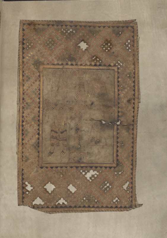
Facing the double-armed cross carpet page on fol. 1v, the recto of the second folio presents the four evangelist symbols disposed around a central cross — one of the earliest surviving fully developed statements of the quattuor una theme in Insular book painting, and a page that functions less as illustration than as a visual prologue to the Gospel text as a whole.
The composition is governed by two concentric frames. The outer border, unusually broad in proportion to the field it encloses, is filled with a dense chequer of small squares set on the diagonal, alternating red, yellow and green against a dark ground. The motif has long been recognised as a translation into pigment of the millefiori glass and enamel insets characteristic of contemporary Celtic and Anglo-Saxon metalwork; comparison with the hanging bowls and with the Sutton Hoo purse-lid is standard in the literature, and the effect on the page is deliberately that of an inlaid object rather than a drawn surface. A narrow inner frame of plain bands isolates the figural field, which is left in the reserved tone of the vellum — an emptiness that is not neglect but a compositional decision, throwing the four symbols and the cross into stark relief.
At the centre stands a cross with a shaft filled by fine ribbon interlace, its terminals expanding into small trumpet-and-spiral panels. The cross is not an object placed within a scene; it is the armature that articulates the surface, dividing it into four quadrants and assigning each symbol its place.
The distribution of the symbols is the page’s most consequential feature. In the upper left the Man (Matthew) appears frontally, a bust-like figure whose body is entirely absorbed into a chequered cloak, arms concealed, feet turned outward in profile beneath the hem. In the upper right, the eagle — assigned here to Mark. Below left, the lion, its body scaled with red and dark lozenges, head turned frontally toward the viewer, tail curling forward between splayed paws. Below right, the calf, reduced to a near-geometric triangle of dotted hide surmounted by a horned head. This sequence — Man, Eagle, Lion, Calf for Matthew, Mark, John, Luke — follows the order transmitted by Irenaeus rather than the Hieronymian arrangement that would become canonical, and it constitutes one of the principal arguments in the long debate over the manuscript’s affiliations and date.
The drawing throughout is linear and heraldic. There is no ground line, no modelling, no narrative gesture; each creature is a sign, held in an eternal present. The palette is restricted to red lead, orpiment, a copper green and dark brown ink. What reads as gold in reproduction is orpiment — Insular illumination of this period does not employ gold leaf, and the point is worth insisting upon in any caption.
The folio’s condition is itself part of its history. The losses visible across the border, the abraded pigment in the central field and the tear crossing the lower right quadrant are consistent with the damage sustained by the codex over its long life at Durrow, including the well-attested early modern practice of immersing the book in water as a remedy for sick cattle.
Carpet Page (2)
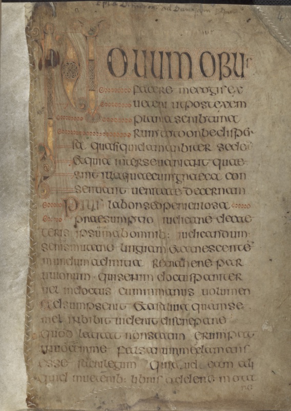
This folio stands apart from the other carpet pages of the codex in that its central field abandons interlace altogether in favour of curvilinear ornament: it is the manuscript’s fullest statement of the trumpet-spiral idiom inherited from the La Tène tradition and from the enamelled metalwork of the Irish Iron Age. Facing the opening of the Prologue on the recto, it functions as a threshold page, marking the transition into the prefatory matter proper.
The design observes the same architecture as its companions — a broad decorated border enclosing a distinct central field — but the two registers are here set in explicit stylistic opposition. The border, running continuously on all four sides, carries a chain of ring-and-ribbon interlace: circular medallions of tight plaitwork linked by broad crossing bands in red lead and orpiment, with occasional passages of copper green surviving along the left and lower edges. The rhythm is regular and metrical, and it serves precisely as a foil to the field within.
That field, laid out against a dark ground, is organised into a vertical sequence of large circular units. Two great roundels occupy the centre, each filled with a triple arrangement of triskeles — spirals of three lobes whose arms terminate in fine coiled scrolls, drawn with a compass-and-freehand precision that repays magnification. Four smaller spiral clusters fill the corners, and the whole is bound together by broad, tapering bands in orpiment and red that sweep between the roundels and expand at their junctions into the characteristic trumpet-mouth or pelta forms. Where these bands meet, the painter has inserted small lentoid and triangular fillers, and at several points along the field’s edge the bands resolve into zoomorphic terminals: green-tinted animal heads with open jaws, visible at the right margin and at the lower centre, which anchor the abstract system to the beast-ornament repertoire found elsewhere in the manuscript.
The visual logic of the page is one of controlled centrifugal motion. Nothing is static: every spiral implies rotation, and the connecting bands transmit that movement from one unit to the next, so that the eye is carried continuously around the field without ever reaching a resting point. The rigid geometry of the border exists to contain this energy. It is a deliberate and sophisticated compositional strategy, and it is precisely what distinguishes the Durrow painter’s handling of the curvilinear mode from the more evenly distributed spiralwork of later Insular books.
The palette is the restricted one used throughout the codex: red lead, orpiment, a copper-based green, and dark brown ink, applied over and around the reserved vellum. The apparent gold is orpiment; no metal leaf is employed.
Condition is comparatively good here relative to fol. 1v — the paint film has held better across the central field — though losses are visible along the left border, the upper edge is abraded, and the decorated leaf has been sewn to a modern guard, the stitching plainly visible around the perimeter as a result of the twentieth-century rebinding.
The opening of Jerome’s letter to Damasus
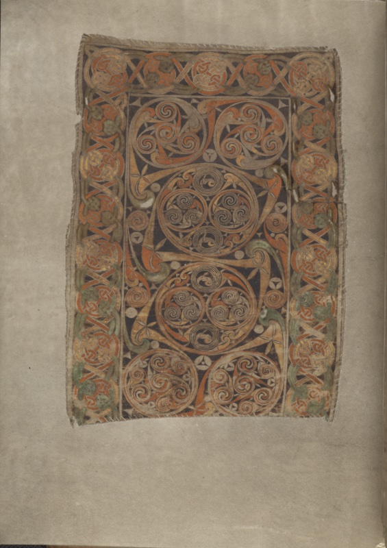
After the sequence of prefatory carpet pages, the codex turns to text, and fol. 4r presents the first decorated incipit of the manuscript: the beginning of Jerome’s dedicatory epistle to Pope Damasus, Novum opus facere me cogis ex veteri — the letter that customarily prefaces the Vulgate Gospels and that here inaugurates the prefatory apparatus.
The page is organised around a single monumental initial N, set entirely in the left margin and running to roughly a third of the written height. Its vertical shaft is a narrow band filled with fine ribbon interlace and passages of orpiment, terminating above and below in expansive trumpet-spiral scrolls of the same curvilinear idiom that governs the carpet page on fol. 3v. A lobed, almost pelta-shaped element attached to the upper shaft carries a small panel of interlace and a chequered roundel; below, the descender resolves into a chain of coiled spirals that trail down the margin. The letter is thus not so much written as constructed — an ornamental object standing alongside the text rather than within it.
From this initial the page demonstrates, with unusual clarity, the Insular principle of diminuendo. The following letters, OVVM OBVS (for Novum opus), are set as large display capitals, hollow-bodied and outlined in dark ink; each is surrounded by a dense field of red dots, the rubrication par pointillé that is one of the diagnostic features of Insular book decoration and that here creates a shimmering ground against the vellum. Successive lines then descend in scale by measured steps — a second, smaller register, then a third — until the script settles into the body hand some eight lines down. The eye is led from ornament to text by graduated stages rather than by abrupt transition.
The body script is a confident Insular majuscule, written with a broad nib in dark brown ink, with generous line spacing and a characteristic repertoire of ligatures and suspensions; abbreviation marks and small suprascript letters (e, bi, ur) are visible at several points where the scribe compressed to reach the line end. Word separation is partial rather than systematic, in the manner of the period. A striking feature of the upper half of the page is the use of red line-fillers: undulating serpentine flourishes in red lead that occupy the space left vacant at the end of short lines within the diminuendo zone, converting a metrical irregularity into an ornamental asset.
A second, subsidiary initial appears roughly midway down: a decorated P introducing Pius labor sed periculosa praesumptio, likewise outlined with red dots and flanked by red flourishes, marking the beginning of Jerome’s second sentence. The hierarchy of initials is therefore already fully articulated — major initial, display capitals, minor initial — in a system that later Insular Gospel books will elaborate but not fundamentally alter.
Two later interventions should be noted. Across the upper margin runs an early modern annotation in a cursive hand identifying the text as the letter of St Jerome to Pope Damasus; and in the upper right corner stands the foliation figure, likewise a later addition. Neither is contemporary with the manuscript.
The condition of the leaf is poor by comparison with the decorated folios. The vellum is heavily stained and cockled, with brown discolouration spreading across the lower half and the outer margin, and the surface abraded in places so that the ink has faded. The upper right corner has been repaired, and the leaf is sewn along its inner and lower edges to a modern guard, the stitching plainly visible — the same twentieth-century conservation campaign evident throughout the codex.
The Symbol of Saint Matthew
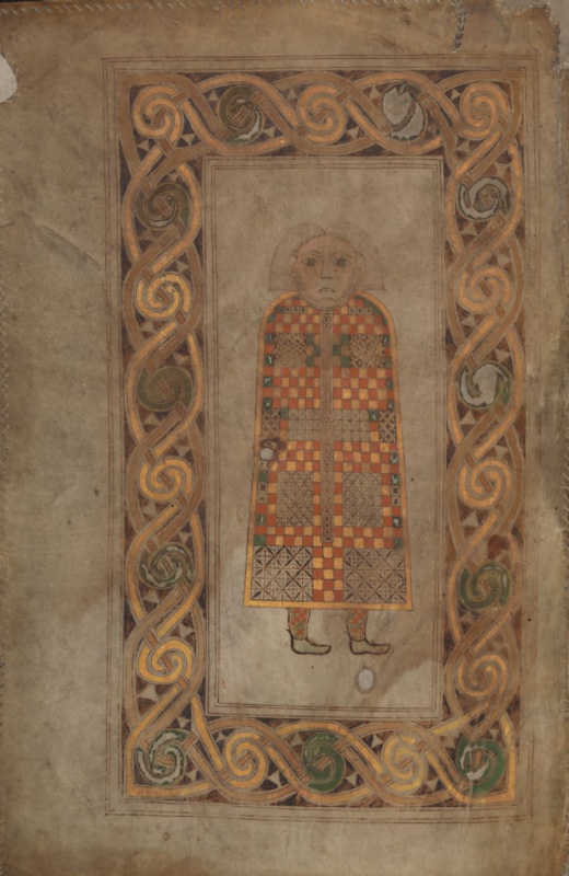
Facing the incipit of Matthew’s Gospel on the recto opposite, this folio presents the Man, the evangelist’s symbol, as a full-page frontispiece. A terminological caution is worth entering at the outset: although the page is often catalogued as a portrait of the evangelist, the figure carries no book, no pen, no halo and no attribute of authorship. It is the imago hominis of the tetramorph, not an author portrait in the late antique sense — a distinction that matters, since the true evangelist portrait enters Insular illumination only with the Lindisfarne Gospels and its Mediterranean exemplars.
The composition is governed by a broad rectangular border of a single, sustained motif: a continuous ribbon interlace in orpiment, outlined in dark ink, whose strands coil at regular intervals into large circular scrolls. Within these coils sit inserted lobes of copper green and, at several points, small triangular fillers set against the dark ground. The design runs without interruption around all four sides and turns the corners without disturbance to its rhythm — a feat of planning that repays attention. The interlace is markedly broader and more open than the tight plaitwork of the carpet pages, and its effect is architectural: a frame that reads as a door surround or a metalwork mount rather than as a flat ornamental band. A narrower inner frame of double ruled lines isolates the reserved field in which the figure stands.
The figure itself is one of the most arresting inventions of early Insular art. It stands frontally, in strict bilateral symmetry, against an empty vellum ground with no indication of setting, ground line or scale. The head is drawn in fine brown outline: an oval face with almond eyes, a long straight nose, a small closed mouth, and hair falling in two straight lappets to either side, cut in a flat fringe across the brow. The rendering is linear throughout, with no modelling, no shadow and no attempt at volume.
Below the neck, the body disappears entirely into a bell-shaped cloak that reaches nearly to the ankles. The garment is filled with a dense chequer of small squares in red lead, orpiment and green, interspersed with panels of fine cross-hatched diaper, and divided down the centre by a vertical orpiment band. No arms are indicated — a striking omission, and one of the page’s defining features. Beneath the hem, two small feet in chequered hose and pointed shoes project outward in profile, turned in opposite directions, so that the figure appears to move laterally while the head confronts the viewer directly. The disjunction is not a failure of draughtsmanship but a convention: the body is a sign, not an anatomy.
The cloak has long been read in relation to contemporary textiles and to the enamelled and millefiori insets of Insular metalwork, the same repertoire that informs the chequered border of the four-symbols page on fol. 2r; comparisons with the Sutton Hoo material are standard in the literature. Whether the garment reflects an actual liturgical vestment or is purely an ornamental construction remains debated.
The palette is the restricted one of the codex throughout — red lead, orpiment, copper green, brown ink — applied over reserved vellum. The apparent gold is orpiment, not metal leaf.
The condition of the leaf is variable. The vellum is discoloured and cockled, particularly along the left margin and the lower edge; a loss has been made good at the upper left corner; small paint losses appear within the cloak and along the border, and two abraded spots are visible below the figure. The leaf is sewn to a modern guard along its outer edges, the stitching plainly visible, as elsewhere in the manuscript.
The Symbol of Saint Mark
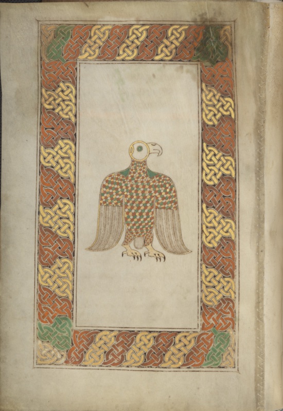
Prefacing the Gospel of Mark, this folio presents the Eagle, and with it the most consequential iconographic decision in the manuscript. In the Hieronymian scheme that became canonical in the Latin West, the eagle belongs to John and the lion to Mark; the Durrow painter follows instead the older order transmitted by Irenaeus, in which Mark receives the eagle and John the lion. The same distribution governs the four-symbols page on fol. 2r, so the choice is systematic rather than accidental, and it constitutes one of the principal arguments in the long controversy over the manuscript’s textual and artistic affiliations.
The page is among the best preserved in the codex, and its condition allows the quality of the execution to be appreciated in a way that the damaged prefatory leaves do not. The border is exceptionally broad in proportion to the field it encloses, filled on all four sides with a continuous, regular plaitwork of flat ribbons in red lead and orpiment, laid over a dark ground and articulated with fine white outlining. The strands cross in a strict, unvarying rhythm — this is plaitwork proper, not the looser ring-and-ribbon interlace of fols 1v and 3v — and the effect is one of woven textile or of a mount in chip-carved metal. At each of the four corners the painter has inserted a panel of copper green, breaking the red-and-yellow alternation and marking the turn; the device is simple and highly effective, and it recurs in Insular ornament as a way of resolving the corner without disrupting the sequence.
Within a narrow double-ruled inner frame, the field is left in the reserved tone of the vellum, entirely undecorated. The eagle stands alone at its centre, small in relation to the space around it — a compositional decision that isolates and monumentalises the creature rather than filling the page.
The bird is shown frontally, wings folded and drooping to either side, its head turned in sharp profile to the right. The head is reduced to a pure circle of orpiment enclosing a green iris, from which a strongly hooked beak projects; there is no attempt at ornithological description. The body and the upper wing coverts are covered in a dense imbrication of small scale-like feathers in red, green, orpiment and reserved white, laid in diagonal rows — again the vocabulary of enamel and millefiori inlay translated into pigment. The long flight feathers of the wings, by contrast, are rendered in fine brown hatching against the bare vellum, a deliberate shift of register from colour to line. Below, a small fan of tail feathers, and two powerful yellow legs terminating in splayed talons drawn with black claws. The bird stands on nothing; there is no ground line.
The tension between the two modes of drawing — the abstract, jewelled body and the comparatively naturalistic, linear wings — is characteristic of the Durrow painter and repays close looking. The creature is simultaneously an ornamental object and a recognisable animal, and the page refuses to resolve the ambiguity.
Faintly visible in the upper part of the field is a line of red rubric, now largely effaced, of which only traces of letters survive. This should be checked against the Library’s own description and against the facsimile before any transcription is proposed; I would not attempt to read it from a photograph.
The palette remains the restricted one of the codex: red lead, orpiment, copper green, brown ink over reserved vellum. What reads as gold is orpiment, not metal leaf.
Condition here is good. The vellum is clean and only lightly discoloured, the paint film largely intact, with minor abrasion at the lower left corner of the border and slight staining at the upper right. The leaf is sewn to a modern guard along the inner edge, the stitching visible in the gutter.
Carpet Page (3)
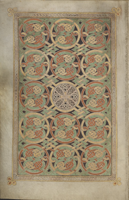
This is the most fully preserved and, by common consent, the most technically accomplished of the carpet pages in the codex. Standing in the prefatory position before Luke’s Gospel, it exhibits an ornamental system quite distinct from those of fols 1v and 3v: neither cruciform nor spiral-dominated, but a continuous, potentially infinite field of interlaced circular medallions, arranged in a strict grid and interrupted only at the centre.
The layout is enclosed by a narrow, restrained border — a fine plaitwork band in white and orpiment over a red ground, framed by ruled lines in yellow, and terminating at each of the four corners in a small trefoil of coiled loops in orpiment with red infill. These corner flourishes project slightly beyond the frame into the margin, a delicate gesture that lightens what would otherwise be a severe enclosure. The proportional relation is the reverse of that on fol. 84v, where a broad border contained a nearly empty field; here the border is minimal and the field is saturated.
Within, fifteen large circular medallions are set in a five-by-three grid against a dark ground. Each is composed of a broad ring — alternately red lead and copper green — through which pass interlaced ribbons in orpiment and reserved white, resolving within the ring into two or three knots of tight plaitwork. The rings are not closed: at their outer edges the bands break free and run horizontally and vertically to link with the neighbouring medallions, so that the entire field constitutes a single continuous interlace rather than fifteen discrete units. The intervening lozenges of dark ground are left visible, and small yellow diamond fillers punctuate the junctions. The alternation of red and green across the grid produces a diagonal chromatic rhythm that the eye reads before it registers the underlying geometry — a sophistication of colour handling not always credited to this painter.
The centre of the composition carries the page’s single interruption and its interpretative key. In place of a coloured medallion stands a roundel in reserved white and pale orpiment, outlined with fine red dotting, containing a cross with expanded arms — an equal-armed crux whose arms terminate in small knots and whose quadrants are filled with tight interlace and, at the upper left, a passage of zoomorphic ribbon resolving into a beast’s head. The chromatic restraint of this roundel against the surrounding red and green is what makes it legible: the cross is not larger than its neighbours, only quieter, and it emerges by subtraction rather than emphasis.
This is a compositional strategy worth dwelling on. Where fol. 1v declares its cross by mass and axial dominance, fol. 85v conceals and then reveals it, requiring the viewer to resolve the field before the christological sign appears. The device is entirely consonant with the meditative function attributed to carpet pages in the Insular tradition, and it anticipates the more elaborate concealments of the Lindisfarne Gospels.
The palette remains the restricted one of the codex — red lead, orpiment, copper green, dark brown ink, reserved vellum — and the apparent gold is orpiment throughout, not metal leaf.
The condition of this leaf is excellent by the standards of the manuscript. The vellum is clean, the paint film almost wholly intact, with only minor abrasion visible along the right side of the field and slight cockling at the outer margin. The leaf is sewn along the inner edge to a modern guard, the stitching visible in the gutter.
The Calf of Saint Luke
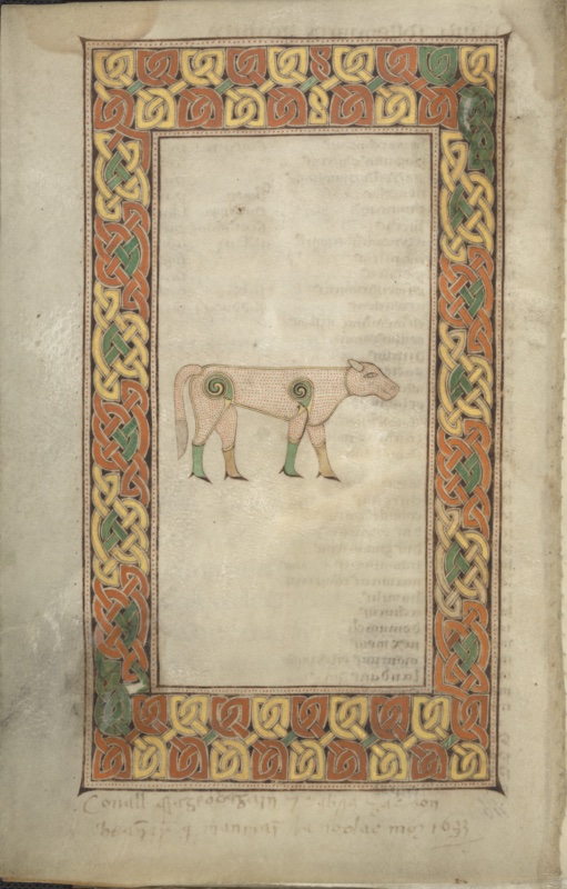
This folio shows the calf (vitulus) and prefaces the Gospel of Luke, an attribution stable across both the Hieronymian and the alternative pre-Vulgate traditions — unlike the eagle and lion, which Durrow famously assigns to Mark and John respectively, following the Irenaean order transmitted in Irish exegesis.
The composition is austere and rigorously frontal in its logic. A broad rectangular border of interlace encloses a field of bare vellum, in the lower half of which the calf is placed without ground line, shadow, or spatial armature. The animal floats in an abstract, atemporal void: it is not a beast observed in nature but a sign, an emblematic cipher whose isolation is itself theological. The disproportion between the vast empty field and the modest scale of the figure is deliberate, generating a charged silence around the symbol.
The interlace frame is constructed from a rhythmic sequence of broad, ribbon-like strands of yellow, orange-red and green, articulated in two distinct registers: the horizontal bands above and below employ a looser, more open pattern of interlocking curvilinear units, while the vertical bands run to a denser, tighter braid. The strands are outlined in dark brown ink and set against a reserved parchment ground stippled with fine red dots along the inner margin — a hallmark of Insular technique, in which the pen dot serves both to define contour and to enliven surface. The palette is characteristic of the earliest Insular books: orpiment yellow, red lead, and a copper green, applied flatly and without modelling or gradation, in a manner that recalls the cloisonné enamels and millefiori of contemporary Irish and Anglo-Saxon metalwork rather than any Mediterranean painterly tradition.
The calf itself is rendered in the same non-illusionistic idiom. Its body is a pale, cream-pink field uniformly scattered with red dots, the head shown in profile with a single large almond eye, incised nostril, and small horns. The most striking feature is the treatment of the haunches and shoulders, where the joints are resolved into tight, spiralling volutes in green and yellow — a device drawn directly from La Tène and metalwork ornament, transposing the joint from an anatomical articulation into an ornamental one. The lower legs are banded in green and ochre, terminating in cloven hooves; the tail hangs as a stiff striated pendant. The result is a body decomposed into a series of decorative panels, more heraldic device than living creature.
Two further material observations bear noting. The show-through of script from the recto and adjacent leaves is clearly visible across the reserved field — a reminder of the thinness of the vellum and of the manuscript’s long working life. More significant is the Irish marginal inscription in a seventeenth-century hand at the foot of the page, dated 1633; this belongs to the group of later notes associated with the antiquary Conall Mac Eochagáin (Conell Mageoghegan), translator of the Annals of Clonmacnoise, and relates to the folk practice of immersing the book in water administered to sick cattle — a use whose apparent placement on the page of the calf symbol has often been remarked, though the connection may well be coincidental. The inscription is a valuable witness to the manuscript’s function as relic and thaumaturgic object long after it ceased to be read liturgically.
Carpet Page (4)
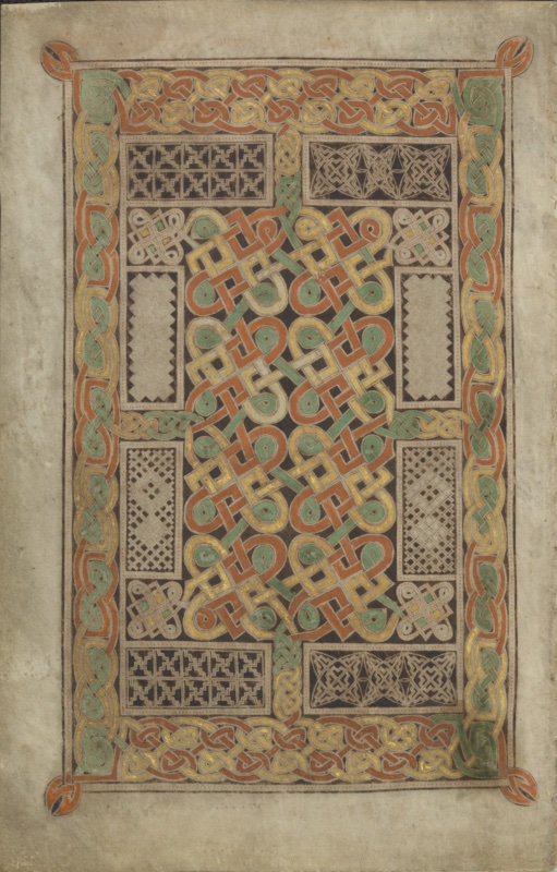
This folio is the fourth of six surviving carpet pages that structure the Book of Durrow, and it is among the most rigorously architectonic of the group. Its position within the codex is governed by the same liturgical and codicological logic observed throughout the manuscript: the full-page ornament stands as a threshold between the Evangelist symbol and the decorated incipit of the Gospel it introduces, so that the reader passes through a zone of pure, non-figural design before encountering the opening words of the sacred text. The facing recto, partly visible at the right of the image, preserves the ornamented opening of the adjoining Gospel, with a large decorated initial complex at the head of the page and a passage of majuscule display script descending in diminishing scale into the body of the text — the characteristic Insular diminuendo.
The term carpet page, borrowed by nineteenth-century scholarship from the visual analogy with Near Eastern textiles, has proven durable but is in several respects misleading. The closer material referent is metalwork: the ribbon interlace, the reserved fields of stippled ground, the compartmentalised panels of fine geometric pattern all recall the enamelled and chip-carved surfaces of contemporary Irish and Anglo-Saxon hanging-bowl escutcheons, brooches and shrine mounts. The illuminator here is not imitating a woven object but translating into pigment and vellum a decorative vocabulary developed in metal.
The page is conceived as a system of nested frames. An outer border of broad, ribbon-like interlace runs continuously around the whole field, executed in orange-red, yellow and green with strands outlined in dark brown and set off by a fine line of red dotting along both edges — the stippling that is a signature of Insular technique and which, at close range, produces a subtle vibration of the contour against the parchment. The four corners are marked by small independent knots that project beyond the rectangle, resolving the frame’s continuity at the very points where it might otherwise close mechanically; these corner terminals also serve, visually, to anchor the composition to the surrounding vellum rather than allowing it to float free.
Within this border, narrow plaited bands articulate the inner field into a grid of compartments organised on a strict double axis of symmetry. The dominant element is a tall central field of broad ribbon interlace, laid out over a dense dark ground, in which strands of orange, yellow, cream and green pass over and under one another in a regular but demanding rhythm. The strands are not uniform: several are doubled or edged in a second colour, and the pattern is punctuated by small green nodes at the points of maximum curvature, a device that both marks the turns and prevents the eye from resolving the design into a single continuous path.
Flanking this central field, eight subsidiary panels are set out in mirrored pairs. Their ornament is of an entirely different order — finer, drier, and executed in delicate pale line on a dark ground rather than in coloured ribbon. Two panels at the upper and lower left carry stepped key or fret patterns of markedly rectilinear character; the corresponding panels at the right are filled with a starred, lozenge-based pattern of interlocking diagonals. The four vertical panels along the sides bear diaper and lattice patterns of hatched squares and diagonals. Four small square knots, set at the inner corners of the field and picked out with touches of yellow and green, mediate between the coarse interlace of the centre and the fine linear work of the panels. The contrast between the two scales of ornament is the page’s principal aesthetic argument: the eye is drawn to the chromatic weight of the centre, then held by the almost microscopic precision of the margins.
The palette remains the restricted one characteristic of the earliest Insular books — orpiment yellow, red lead, and a copper green, applied flatly, with the parchment itself functioning as a fourth tone. There is no gold leaf; the yellow, as is often observed, may have served as a substitute for it. Two areas of loss and abrasion are visible along the outer border, where the pigment has flaked to expose the underlying vellum, and the reserved margins show the discolouration and handling wear consistent with a book that remained in use, and in veneration, for many centuries.
The Lion of Saint John
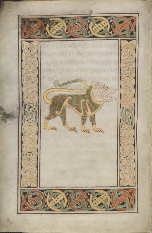
This folio carries the last of the four Evangelist symbols in the Book of Durrow and introduces the Gospel of John. Its attribution is one of the manuscript’s most discussed features: whereas the Hieronymian arrangement, which became normative in the Latin West, assigns the lion to Mark and the eagle to John, Durrow follows the alternative sequence transmitted by Irenaeus and preserved in Irish exegetical tradition, in which the lion belongs to John and the eagle to Mark. The choice is not an error but a deliberate adherence to a distinct patristic authority, and it constitutes one of the principal arguments for locating the manuscript within an insular milieu conservative in its textual and exegetical inheritance. As elsewhere in the codex, the symbol page stands within a triadic apparatus — symbol, carpet page, decorated incipit — through which the reader is led by degrees from pure ornament to sacred text.
The lion is shown in strict profile, striding to the right, unsupported by ground line or any indication of setting. As with the calf of Luke, the beast inhabits a void: it is a heraldic sign rather than a creature observed, and its isolation within the reserved field is a theological statement about the emblematic status of the Evangelist symbols. Yet the treatment here is markedly more energetic than that of the calf. The head is thrust forward, the jaws parted to reveal a row of small triangular teeth drawn in fine red line, and the long tail rises in a sweeping arc over the back before resolving into a tight spiral terminal — a device that simultaneously closes the composition and injects a note of coiled tension.
The animal’s body is articulated through a dense field of lozenge-shaped scales alternating in orange-red and green, laid out in regular diagonal rows and confined within broad contour bands of yellow that trace the shoulder, flank, haunch and limbs. These yellow bands function as a linear armature, separating the patterned body into discrete zones much as cloisons separate enamel fields in contemporary metalwork; the correspondence with Irish and Anglo-Saxon polychrome ornament — millefiori, chip-carving, enamelled escutcheons — is here particularly close. The head and neck, by contrast, are reserved in the pale tone of the parchment and animated only by fine red stippling, so that the face reads as a lighter mass set against the chromatic density of the body. A single large eye with yellow iris dominates the head, and a spiral volute marks the position of the ear. The paws are rendered in flat yellow with articulated claws, and the forelimbs and hindlimbs carry their own reduced version of the lozenge pattern.
The frame comprises two distinct ornamental systems, deliberately contrasted. The horizontal bands above and below consist of a row of large circular interlace medallions — five in each register — alternating in orange-red, yellow and green over a dark ground, with small white triangles filling the interstices between the roundels; the effect is emphatically metallic, recalling a strip of mounted enamel plaques. The vertical bands at either side employ an entirely different idiom: a dense, fine-strand interlace worked in pale cream ribbon, each strand stippled along its length with red dots, running over a dark ground and punctuated at intervals by segments of yellow and green. The tonal and rhythmic opposition between the coarse, chromatic roundels of the horizontal registers and the fine, monochrome plaiting of the vertical ones is a compositional strategy also observable on the carpet pages, and it demonstrates the illuminator’s control over the relative visual weight of different ornamental scales.
- Two material features deserve note
The reserved field shows pronounced show-through from the adjacent leaves, including a passage of red rubricated script legible in the lower half — a consequence of the thinness of the vellum, and a reminder that these pages were never seen in the isolation that modern reproduction affords. The outer margin at left bears substantial staining and darkening, consistent with prolonged handling and with the manuscript’s later history as a venerated object rather than a working liturgical book.
Carpet Page (5)
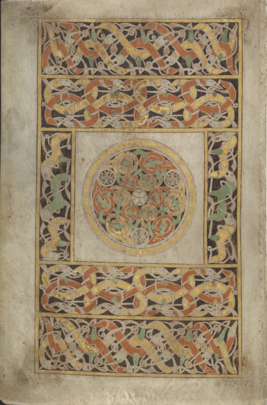
This is the carpet page that follows the lion symbol of Saint John and precedes the Johannine incipit, and it is by common consent the most sophisticated of the group — the page on which the Durrow illuminator most fully exploits the zoomorphic vocabulary that elsewhere in the codex remains subordinate to abstract ribbon interlace. Where the other carpet pages are built from geometric plaiting and compartmented fret and lattice patterns, here the entire framing structure is composed of interlaced animals, and the abstract ornament is confined to a single central medallion. The inversion is deliberate and marks the page as the culmination of the manuscript’s decorative programme.
The composition is organised as a rectangle divided into five horizontal registers, with the central register subdivided into three: two narrow vertical panels flanking a large square field. The four broad horizontal bands, two above and two below, are filled with elongated quadrupeds — usually described as hounds or wolves, though their morphology is deliberately unstable — whose bodies are drawn out into ribbon-like strands and woven through one another in continuous, unbroken sequence. The animals are rendered in orange-red, yellow and cream with green infill at selected points, their necks and torsos attenuated to the point of near-abstraction, so that the eye oscillates between reading the pattern as interlace and reading it as a procession of beasts. Only the small pointed heads, the round eyes marked with a dot, the open jaws and the spiral hip-joints permit the animals to be identified at all. The upper and lower registers of each pair differ subtly in rhythm and in the density of their weave, so that the four bands are not repetitions but variations on a shared principle.
The two vertical panels at either side of the central field carry a more open composition: larger, more legible quadrupeds with clearly articulated heads, elongated snouts and green-filled bodies, arranged in an interlocking vertical chain against the dark ground. Their greater scale and looser spacing provide visual relief between the dense horizontal registers and the tightly worked medallion.
At the compositional and conceptual centre lies a circular field, framed by concentric bands of gold and cream and set within a reserved square of bare vellum. Its interior is filled with a rotational arrangement of interlocking knots and small circular medallions in orange-red, green and yellow, disposed around a tiny central rosette. The design is governed by a strict radial symmetry — a spinning, centrifugal pattern of the kind familiar from the millefiori and enamelled escutcheons of Irish hanging bowls, and from the openwork discs of contemporary metalwork. Four smaller roundels set at the cardinal points within the circle carry a distinct, denser fret-like ornament in muted tones, punctuating the rotation. The isolation of this medallion within its plain square field is the page’s most striking device: after the horror vacui of the surrounding bands, the eye arrives at a zone of quiet in which a single, perfectly resolved geometric figure is displayed.
Two further features merit attention. The four corners of the outer frame carry delicate zoomorphic terminals — attenuated beasts with scrolled tails, drawn in fine line with minimal colour — which extend beyond the rectangle into the surrounding margin and prevent the frame from closing as a purely mechanical boundary. And throughout the page a lavish use of gold is apparent, particularly in the framing fillets and in the bodies of the interlaced animals, where it produces a metallic sheen quite unlike the flat matte surfaces of the manuscript’s other decorated folios.
The animal ornament here has long been recognised as bearing a close relationship to Germanic Style II zoomorphic interlace, of the kind found on the Sutton Hoo shoulder-clasps and purse-lid, and this page is accordingly central to arguments about Anglo-Saxon components in the Durrow illuminator’s formation. Whether this indicates a Northumbrian place of production, or the circulation of metalwork models within a Columban network extending across the Irish Sea, remains open.
Carpet Page (6)
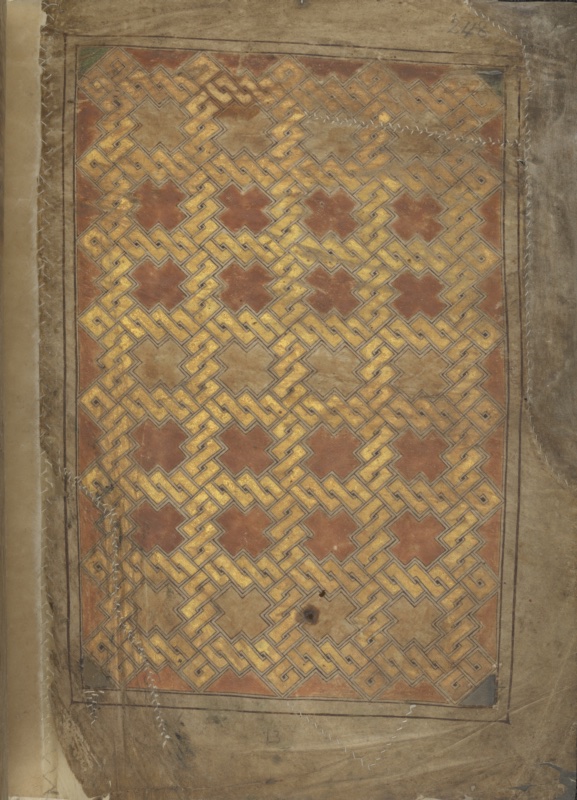
This folio closes the Book of Durrow, and its position is as significant as its design. Whereas the other carpet pages of the codex function as thresholds — standing between Evangelist symbol and Gospel incipit, preparing the reader for the sacred text — this one has nothing after it. It is terminal rather than liminal: an ornamental colophon, a final seal set upon the completed book. The recto placement is itself unusual and reinforces the sense of an ending, since the reader arrives at it from the concluding text on the facing verso rather than passing through it into anything further.
The design is the most severely disciplined in the manuscript. The entire field is occupied by a single continuous stepped-fret pattern — a key or meander ornament built from strictly rectilinear elements, without a single curve anywhere in the composition. Broad yellow bands, outlined in fine dark line and separated by a narrow reserved channel, interlock in a diagonal lattice across the surface, weaving over and under one another at every intersection. The interstices are filled with a warm brownish-red ground, and where the fret resolves into open spaces, these take the form of stepped, cross-like or lozenge shapes distributed at regular intervals across the field. The result is a pattern of remarkable optical density: the eye can follow individual strands for a short distance before losing them in the weave, and the alternation between yellow bands and red ground produces a persistent figure-ground reversal — one reads now the gold-toned lattice, now the red crosses it encloses.
This idiom is quite distinct from the ribbon interlace and zoomorphic ornament of the other carpet pages. Its ultimate ancestry lies in the rectilinear key patterns of late La Tène metalwork and, more immediately, in the chip-carved and enamelled ornament of Irish and Anglo-Saxon fine metalwork, where stepped fret designs of exactly this character appear on escutcheons, mounts and shrine plates. The illuminator has here confined himself to a single ornamental register and pursued it to exhaustion — an aesthetic of relentless repetition that has more in common with the ornamented surfaces of metal objects than with any painted tradition.
Equally notable is what the page lacks. There is no elaborate framing apparatus of the kind that governs fols. 125v and 192v: only a plain double ruled line encloses the field, with no interlace border, no corner terminals, no compartmented subsidiary panels. The whole page is a single undivided expanse. Whether this austerity is a deliberate rhetorical choice appropriate to a closing page, or a consequence of the folio’s position and condition, is worth considering carefully.
The material condition demands comment, since it is inseparable from what one sees. This is the outermost surviving leaf of the manuscript, and it has suffered accordingly. The vellum shows extensive abrasion and discolouration, particularly across the upper and outer areas, where the pigment has worn thin and the underlying skin shows through. Several substantial repairs are visible: lines of fine white stitching cross the leaf at the upper right, along the left edge, and at the lower margin, and a small perforation with darkened edges interrupts the pattern in the lower centre. The outer margin has been reinforced with a mounted strip. These interventions belong to the manuscript’s long conservation history, most consequentially the rebinding of 1954, and they testify to the physical vulnerability of a book that was for centuries handled as relic and talisman rather than protected as an artefact. In the upper right corner a modern pencil foliation, 248, is legible, and a small letter B appears in the lower margin — later signatures of the codex’s institutional life.
Art-historical relationships and sources
The Book of Durrow is a synthesis of at least four visual traditions:
- Germanic/Anglo-Saxon metalwork: the ribbon-animal interlace derives from Style II as seen at Sutton Hoo and on the Benty Grange hanging bowl; the chequered Man-cloak evokes millefiori/cloisonné. The Staffordshire hoard has been adduced as a fresh parallel strengthening the possibility of a Northumbrian connection.
- Celtic La Tène tradition: the spirals, trumpet-patterns and triskeles descend from Iron Age Celtic metalwork.
- Coptic/Eastern Mediterranean: the carpet-page concept and certain interlace/mesh designs have Coptic and Syriac parallels, implying knowledge of Eastern models (TCD’s materials suggest at least one artist had contact with the Eastern Mediterranean).
- Pictish and Late Antique/Italian: some animal and figural forms have been linked to Pictish stones; the codex structure and prefatory apparatus derive ultimately from Late Antique Italian Gospel-book models.
Relationship to other manuscripts
In the standard developmental account, Durrow follows the Cathach of St Columba (c. 600, Royal Irish Academy — the earliest surviving Irish manuscript, showing the first tentative enlarged/diminuendo initials) and the fragmentary Durham Gospel Book (Durham Cathedral Library A.II.10, which carries the earliest “INI” monogram), and precedes the Durham Gospels (A.II.17), the Echternach Gospels, and the Lindisfarne Gospels (begun c. 700). Durrow probably served as a partial exemplar for the Book of Kells (c. 800), some of whose opening pages reproduce the Durrow text “including minor errors,” pointing to direct copying.
Durrow vs. Lindisfarne — which comes first? The consensus places Durrow before Lindisfarne (Durrow’s interlace is larger and less minutely detailed; “the extreme level of detail found in later Insular books begins here”). Two studies — “The Book of Durrow: The Northumbrian Connection” (in Northumbria’s Golden Age, 1999, pp. 315–326) and “The Book of Durrow and the Lindisfarne Gospels” (in The Lindisfarne Gospels: New Perspectives, Brill, 2017, pp. 166–182) — examine the relationship in detail.
The dating and origin controversy
This is the crux of Durrow scholarship. Because the surviving colophon is a later relic-claim (not a datable scribal signature) and no radiocarbon date exists, the question turns entirely on palaeography, ornament, textual affiliation and historical inference.
Four positions have been argued:
-
Ireland / Durrow. This position reads the ornament and Columban associations as evidence of Irish manufacture. The later provenance (the book was demonstrably at Durrow by 916), the colophon, and the cumdach are used as supporting evidence. Recent introductory scholarship leans toward Durrow or at least Ireland while conceding uncertainty; one widely cited summary states the book “was probably made in Ireland, in or near Durrow Abbey.”
-
Iona. Argued most forcefully in a 1990 study, “The Cross-Carpet Page in the Book of Durrow: the Cult of the True Cross, Adomnán, and Iona” (The Art Bulletin 72, 1990, pp. 174–223), which proposed that the f. 1v cross-carpet page and the f. 2r symbols page were designed to evoke the loca sancta of the Holy Sepulchre in Jerusalem, drawing on Adomnán’s De locis sanctis, and concluded in favour of “an Iona provenance of ca. 685.” A later restatement, “The Book of Durrow and the question of programme” (Anglo-Saxon England 26, 1997, pp. 23–39), maintained that these references point to Adomnán, the scholarly abbot of the Columban foundation of Iona, who very likely sponsored the creation of the gospel-book between 682 and 686. An earlier study, “Before the Book of Durrow” (Acta Archaeologica 18, 1947, pp. 141–174), is grouped with the Irish/Columban camp.
-
Northumbria / Lindisfarne. Argued from textual and palaeographical evidence in scholarship tending to a slightly later date c. 680; a related study, already cited above, continues this line by pressing the Northumbrian connection. A standard survey (Insular Manuscripts 6th to the 9th Century, 1978, no. 6, p. 30) summarised the field: a date “between the Durham Gospel fragment … and the Lindisfarne Gospels … in the middle of the second half of the 7th century seems most probable”; the provenance and colophon support an Irish/Iona (Columban) origin, while textual and palaeographical evidence is adduced by those favouring an origin in Northumbria, who also tend to a slightly later date c. 680.
-
Pictish Scotland enters chiefly as a stylistic factor (animal and figural comparanda), not as a full origin hypothesis.
The evidence genuinely underdetermines the answer, and the mobility of scribes and books within the Columban federation may make a single “birthplace” the wrong question. My reading of the literature is that the strongest defensible position is a Columban origin (Durrow, Iona, or an Ireland–Iona–Northumbria network) in the later seventh century, roughly c. 660–690. The Iona hypothesis of c. 682–686 is the single most precisely argued position but rests on a contested iconographic reading; by contrast, one recent account notes that “recent research indicates that it was probably produced early in the eighth century.” The safest scholarly formulation remains: Insular, Columban, c. 650–700, place undetermined.
Provenance and later history
The Columban familia and Durrow. Durrow (Dair Mag, Co. Offaly) was founded by Colum Cille in the sixth century and became an important centre of learning. Whether the book was made there is unproven, but it was certainly there by 916.
The cumdach of Flann Sinna. Flann Sinna mac Máele Sechnaill (d. 916), high-king of Ireland of the southern Uí Néill (Clann Cholmáin), commissioned a silver cumdach (book-shrine) for the manuscript — the earliest documented Irish cumdach, made “at the behest of King of Ireland Flann Sinna.” It was recorded by the antiquary Roderick O’Flaherty in 1677 (his note is now bound into the book as folio IIv), describing a silver cross whose arm bore the (unrecorded) craftsman’s name and whose shaft invoked St Colum Cille’s blessing on King Flann “who caused this cover to be made.” The shrine disappeared during the military disturbances of 1689. See “The Inscriptions on Pre-Norman Irish Reliquaries,” Proceedings of the Royal Irish Academy 96C (1996).
Medieval and early modern custody. The book remained at Durrow through the medieval period; after twelfth-century church reform the Augustinian canons administered the site. It later passed, with the Durrow crosier, to the McGeoghan family as hereditary keepers. James Ussher studied it (probably as Bishop of Meath, 1621–23), distinguishing the two “gospels of St Colum Cille” as the Books of Kells and Durrow.
The cattle-cure tradition. By the 1620s–1630s the custodian was reportedly renting out a section of the book (part of John) to farmers, who dipped it in a cattle trough; the water was then given to sick cattle as a cure. This is documented in Conall Mac Eochagáin’s testimony (c. 1627/1633) and corroborated by the physical water-damage to ff. 208–221.
Donation to Trinity College. Henry Jones (c. 1605–1682), Bishop of Meath and vice-chancellor of TCD, presented the book (with the Book of Kells) to Trinity College Library in the period 1661–1682. It has remained there since, surviving the 1689 Jacobite occupation, which cost it its shrine.
The 1954 rebinding. The book was rebound in 1954 (see Codicology). The campaign revealed the singleton structure of many leaves, the flesh-side selection for ornament, and evidence of historical misbinding; it produced a reconstruction assigning f. 1v to Matthew. Correction of a common error: one vendor source dates this conservation work to “1896–1900” — this is false; the conservator responsible (1896–1990) rebound Kells in 1953 and Durrow in 1954.
Historiography and reception
From the nineteenth century onward — through antiquarian description and early catalogue work — the book was celebrated as a monument of Irish Christian art. Twentieth-century scholarship became polarised along national lines: one 1939 study argued for strong Irish influence, while Essai sur les origines de la miniature dite irlandaise (Brussels, 1947) argued provocatively for a Northumbrian (Lindisfarne) origin for the major Insular books.
Oxford Bibliographies observes that this 1947 book “exerted disproportionate influence over the question of provenance, demonstrating heavy racial bias toward the Irish,” and that these two studies together “set the nationalistic tone of Insular manuscript scholarship for much of the later twentieth century.” The very category “Insular” (as opposed to “Irish” or “Hiberno-Saxon”) emerged partly to defuse this nationalist framing. More recent scholarship has moved toward network models of production and toward iconographic, codicological and scientific analysis, reacting against the older nationalist paradigm. (Note: the Durrow site itself was a flashpoint of pre-independence cultural politics — the 1914 Durrow Abbey access dispute — a reminder that the manuscript’s reception is entangled with Irish national identity.)
Against this backdrop of national partisanship, George Henderson’s From Durrow to Kells: The Insular Gospel-Books, 650–800 (Thames & Hudson, 1987) marked a deliberate change of register. Its stated aim was to treat Durrow, the Durham Gospels, the Echternach and Lindisfarne Gospels, and Kells not as way-stations on a single stylistic road running from “primitive” to “developed” ornament — the implicit teleology shared by both the Irish and the Northumbrian partisans — but as a series of discrete intellectual projects, each answering to its own theological programme and to the demands of the gospel text it transmits. The effect was to relocate the burden of explanation away from the question that had consumed earlier scholarship — where, geographically, was this made? — and toward the question of what the decoration is doing at any given opening: why a carpet page precedes this incipit and not that one, why the evangelist symbols are disposed in this order rather than another, why an initial swells or contracts as it does.
Applied to Durrow, this method bears directly on points already documented above. It reads the Irenaean ordering of the symbols on the four-symbols page (fol. 2r) and at the Mark and John openings — eagle to Mark, lion to John, against the Hieronymian assignment that would later prevail — as a textual and exegetical choice with consequences for the ornamental programme, not as a curiosity to be filed alongside the dating debate. In this account the symbols page and the double-armed cross of fol. 1v are conceived as a paired prefatory statement in the sense already described under Decoration programme, and the diminuendo structure of the incipit pages (fol. 4r and its successors) is treated as evidence of a scriptorium thinking in terms of graduated address to the sacred text, a habit of mind traced forward into the far more elaborate diminuendo passages of Kells.
On the dating and origin controversy, this position is characteristically cautious: it does not adjudicate Ireland, Iona and Northumbria against one another so much as insist that the ornamental vocabulary common to all three milieux — the debt to Germanic Style II interlace, the La Tène-derived spiral repertoire, the metalwork analogies invoked throughout this entry — makes a single point of origin an unpromising question to press too hard, a position closer to the “network” reading of more recent scholarship than to the older nationalist certainties. Where the book has proved most consequential for Durrow studies specifically is in its treatment of the manuscript’s relationship to Kells: it reads Kells’s opening pages, which reproduce Durrow’s text “including minor errors” (a phrase already cited above under Relationship to other manuscripts), as confirmation that Durrow functioned within the Columban familia as an authoritative exemplar whose textual and decorative choices were consciously inherited, elaborated and in places corrected by the Kells workshop a century or more later.
From Durrow to Kells remains, as its subtitle promises, the standard point of departure for situating Durrow within the wider Insular tradition rather than treating it in isolation, and its account of the relationship between decoration and textual articulation underlies much of the subsequent scholarship cited in this entry, including later iconographic work. Its author’s Cambridge lineage — the department traces a line of descent through earlier generations of Cambridge art historians — is itself part of the historiography of Insular studies sketched here: it places the book’s most influential post-war English-language synthesis within an art-historical tradition distinct from, and in useful tension with, the Dublin-based custodial scholarship represented elsewhere in this account and the earlier partisan debates already described above.
Conclusion
The Book of Durrow occupies a position in the history of Insular art that no later, more lavish manuscript can displace: it is the earliest survivor of a fully illuminated Gospel book in this tradition, the point at which carpet page, evangelist symbol and decorated incipit first appear together as a coherent decorative system rather than as isolated experiments. Everything that follows in Insular book painting — the Durham Gospels, Lindisfarne, Echternach, and eventually Kells itself — presupposes a programme whose basic vocabulary Durrow had already assembled by the later seventh century. That priority, more than any single page, is the manuscript’s deepest claim on scholarly attention, and it is why a disagreement over a few decades of dating carries consequences for the whole field rather than for one book alone.
The physical object bears the marks of that priority as much as the decoration does. A vellum codex of 248 folios, written by a single confident hand in Insular majuscule, reduced by trimming and rebinding, its leaves surviving largely as singletons rather than intact bifolia — the codicological evidence recovered by twentieth-century conservation work is inseparable from any account of what the book originally looked like. The restrained three-pigment palette of red lead, orpiment and copper green, established by non-invasive scientific analysis and confirmed independently by more than one laboratory, is not merely a technical footnote: set against the far richer palette later deployed in Kells, it is a concrete measure of how much the Insular decorative repertoire expanded in the century and a half separating the two books.
The textual contents — a Vulgate Gospel text with the customary Hieronymian prefatory apparatus, evangelist symbols assigned in the older, pre-Hieronymian order, and a colophon later reworked to claim authorship by Colum Cille himself — show a manuscript that was never treated merely as a reading copy. Successive generations added a land memorandum, a Pentecost lection, and seventeenth-century signatures and devotional notes, each layer testifying to continued use, veneration, and eventually superstition, long after the book’s original liturgical function had receded into the past.
The decoration programme itself repays the page-by-page attention given to it above precisely because its logic is systematic rather than accumulative. The same triadic sequence — evangelist symbol, carpet page, decorated incipit — recurs before each Gospel with the sole exception of Matthew; the same restricted palette and the same repertoire of ring-and-ribbon interlace, trumpet-spiral ornament, and stepped fret pattern recur across otherwise very different compositions; and the same Irenaean ordering of the symbols, eagle to Mark and lion to John against the later Hieronymian norm, is maintained with a consistency that rules out accident. Read together, the decorated openings function less as a gallery of separate masterpieces than as a single sustained argument about how ornament should address sacred text.
That argument draws on genuinely disparate sources — Germanic Style II animal interlace of the kind found at Sutton Hoo, the La Tène-derived spiral vocabulary of native Celtic metalwork, carpet-page conventions with plausible Coptic and Eastern Mediterranean analogues, and a codex structure ultimately descended from Late Antique Italian Gospel-book models — and it is precisely this synthesis of traditions, rather than any single source, that has made the question of where the book was produced so difficult to settle and so consequential to answer.
The dating and origin controversy, surveyed at length above, cannot be resolved on the evidence currently available, and this entry has not tried to pretend otherwise. What can be said with confidence is that the debate itself, run across Ireland, Iona and Northumbria, has been more productive than any single verdict it might have reached, since it has forced sustained attention to palaeography, textual affiliation, ornament and historical context alike. The most defensible position remains a Columban origin somewhere within the Durrow–Iona–Northumbria network in the later seventh century — a formulation that treats the mobility of scribes and exemplars within the Columban federation as part of the answer rather than an obstacle to finding one.
The book’s later life is as instructive as its making. A silver cumdach commissioned by a tenth-century high-king, medieval custody by hereditary keepers, a documented folk practice of dipping sections of the manuscript in water for the cure of sick cattle, the loss of its shrine during the Jacobite occupation of Trinity College, and its eventual, permanent donation to Trinity College Library together trace the arc by which a working Gospel book became first a relic and then an institutionally protected national treasure. The physical damage catalogued throughout this entry — water staining, paint loss, a rebinding campaign four centuries after the last — is the residue of exactly that transformation, and it should be read as evidence of the manuscript’s centrality to Irish devotional and cultural life rather than as simple neglect.
The historiography traced here, from nineteenth-century antiquarian celebration through the openly nationalist polarisation of the mid-twentieth century to the more recent turn toward network models, iconographic analysis and hard scientific data, is itself a history of how scholars have used Durrow to answer questions that were not always about Durrow at all. What the more recent, methodologically self-aware scholarship shares — whatever its position on the Ireland–Iona–Northumbria question — is a willingness to let the manuscript’s own internal logic, its systematic ornamental choices and its precise relationship to the text it transmits, do more of the interpretive work than the search for a single national origin ever could. Read in that spirit, the Book of Durrow is less a puzzle to be solved than the foundation on which the entire subsequent achievement of Insular manuscript illumination, from Lindisfarne to Kells, was built.